Essay #3: Momentum: Countries
Plus! Replication Crisis vs. Data Mining, & Using Correlations to Have Your Cake and Eat it Too

PDF of Essay
I’m experimenting with a few writing formats; if reading/printing a PDF is easier for you, please use this link.
Table of Contents
I. For Countries, the “Fell off a Cliff” Point was 13 Months
The momentum anomaly isn’t unique to stocks and sectors. Momentum has been documented for country equity indices1 in a number of studies, including Value and Momentum Everywhere (2012) (VME2012), Two Centuries of Multi-Asset Momentum (2017) (TC2017), and Macromomentum (2001) (MM2001).
In Essay #2, we documented that any “reasonable measure” of momentum should not include lagged month #14 if your tradable universe is USA sector/industry portfolios.
In constructing country equity momentum, VME2012 uses the (12,1) construction2, TC2017 uses3 (12,2), and MM2001 uses (6,0). Reminder: Fact, Fiction and Momentum Investing (2014) cautions us to not try to data-mine4 for the best performing rule set among all possible (X, Y) constructions.
Figure 1 below, following the pattern of “fell off a cliff charts” from Essay #2 (and created from code here) demonstrates that if you constructed momentum from country equity indices, you historically tanked your results if you included month #13:
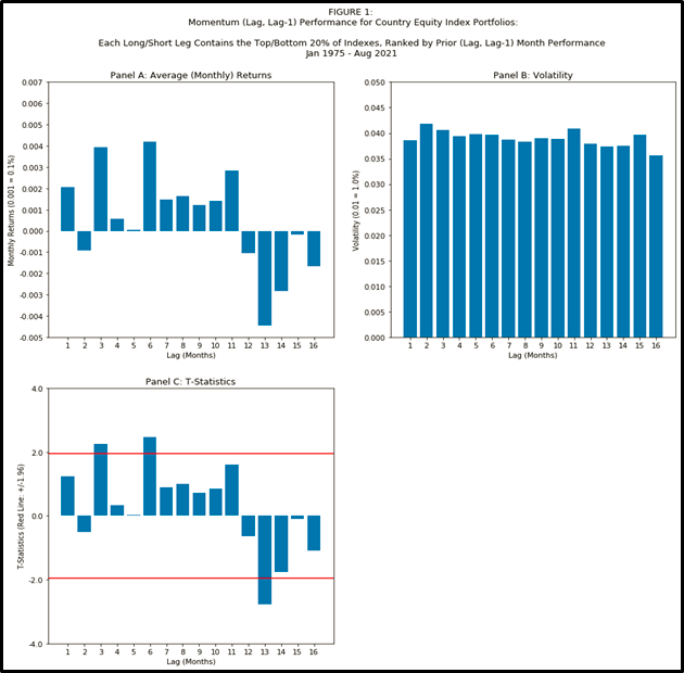
Some additional features of Figure 1 are worth enumerating:
Regarding lag #1: unlike the USA sectors explored in Essay #2, the first month’s lag was not statistically5 significant for country equity indexes. A reminder of how STRONG the 1 month signal was for sectors: in Essay #2, the final 9 charts (Figures 7 – 15) consider multiple sub-periods (1926-2021, 1926-1973, 1974-2021) and vary the number of securities per long/short leg, and for all of those 9 variations of parameters, the first month’s lag was always statistically significantly positive.
Regarding lag #12: the in-sample time period of your research data matters. In Essay #2, lag month #12 was significantly positive for all of the parameter variations in Figures 7-15, EXCEPT for where the sub-period was 1974-2021. For our data set of country indexes, we can’t go back earlier than 1975, and, just like the 1974-2021 period for sectors, we find no statistical significance for lag #12 for countries.
Regarding lag #6: The longest look-back lag that contributed significantly for countries was at 6 months. While the t-statistic exceeds 1.96, this appears to not hold up to reasonable robustness checks; the motivated reader can re-run the code for Figure 1 but change the input variable
percent_of_securities_per_legfrom 0.20 to 0.33 and find that the significance of lag 6 will disappear (and is replaced by lag 11 having a t-stat exceeding 1.96; to be clear, we should not accept lag 11 as special either).Same as we saw in Essay #2, the volatility is flat across lags for countries. This pattern is unlike the spike for lag 1 seen in Novy-Marx (2012)’s analysis of single stocks.
II. Correlations: Having Your Cake and Eating It Too
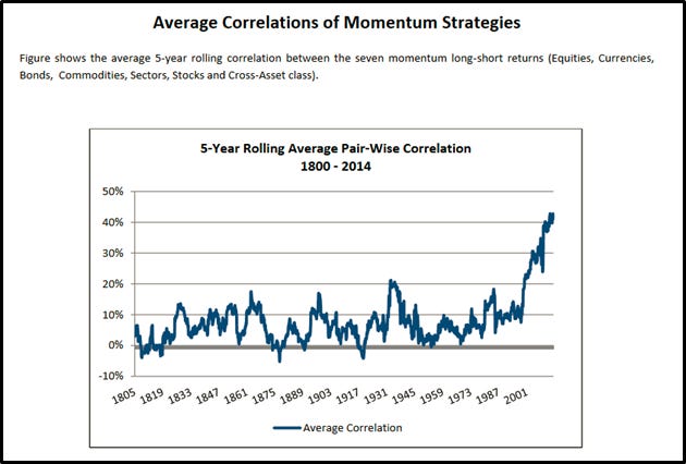
VME2012 suggests that combining several sources of momentum (e.g. sectors, countries, stocks, bonds, commodities, and currencies) can produce a more robust momentum6 factor. The authors argue that statistically significant correlations among each of the momentum strategies7 suggests the existence of a momentum factor “Everywhere”; however8, since the correlations aren’t close to 100%, there are diversification benefits to combining the different momentum strategies.
When it comes to correlations among momentum sources, how high is too high?
TC2017 suggests that the benefits of combining different sources have been declining, noting significant recent rises in pair-wise momentum portfolio correlations. Below is Figure VI from TC2017:
Whether a high or low correlation is good or bad depends on your objective; your objective might be performing world-class academic research, or it might be optimizing risk-versus-reward. Here are two competing objectives to consider:
Since the momentum anomaly exists for multiple asset classes, it’s less likely to be p-hacked or spuriously data-mined. One could argue that the higher the correlation among different types of momentum, the stronger the argument that a global momentum factor exists.
If, say, sector momentum and country momentum both have positive Sharpe ratios and aren’t completely correlated9 to each other, then of course you should combine them when investing. The lower that correlation is, the stronger the resulting Sharpe ratio of the combination is.
Question: Have higher correlations persisted after 2014?
In Figure 2 I plot from historical correlations10 from the 8 momentum factors from VME2021, updated through March 2021; each point on the plot represents an average of (8 choose 2) = 28 correlations of momentum factors from 8 sources:
4 stock momentum factors (USA, Japan, UK, Europe-ex-UK)
1 country equity index momentum factor (the subject of this Essay)
1 currency momentum factor
1 government bond momentum factor
1 commodity momentum factor
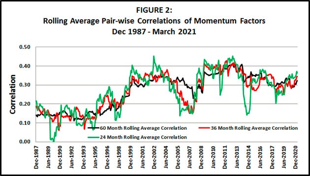
The takeaway from Figure 2: the raised correlations from TC2017 appear to have peaked around 2013-2014 depending on measurement window, though as of 2021 the correlations still remain at elevated levels, at least relative to pre-1999 correlations.
Appendix A: Version Control / GitHub
Any code, data, and other artifacts produced for this essay will be saved at https://github.com/kyle-binder-essays/essay_repo1/tree/essay_03
Sometimes data providers11 revise their data. It’s useful to be able to retrieve the version that I used previously, and that data will be saved in the above repository.
Appendix B: Construction of Spliced ETF Data Set
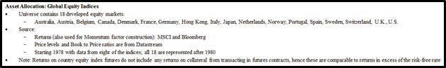
Below is how AQR constructs their data set of countries in VME2012, per the AQR website:

I follow similar steps which will be detailed in this section.
How do you choose which “developed” countries to include in this research data set? Can you do anything to mitigate survivorship bias?
All 18 countries that exist in the AQR data set have investable country index ETFs that exist today, but, ask yourself: would you have included in Russia in 1998? What about Malaysia in 1997?
To generate the data set used for Figure 1, I use returns from ETFs for the same 18 countries of the AQR data set. Many of those countries have an ETF with an inception12 date in 1996; I splice the ETF returns with the USD returns from the country indexes found here on Ken French’s website for wherever an ETF/index match exists. A complete CSV of spliced ETF + index returns is here.
The spliced data set also includes Malaysia, whose most recent observed index return is October 2001. Though Malaysia is not in the AQR data set, I wanted to include an example of a country that “did not survive” – especially given all of my verbiage in Essay #2 about survivorship bias.
Had there been more “did not survive” countries in the Fama/French public data library, I’d like to think I’d have been inclined to include them too.
Figure 3 that follows indicates the inception dates13 for ETFs and indexes of the 19 countries (the 18 AQR “developed” countries + Malaysia that “did not survive”) used in this essay’s data set.
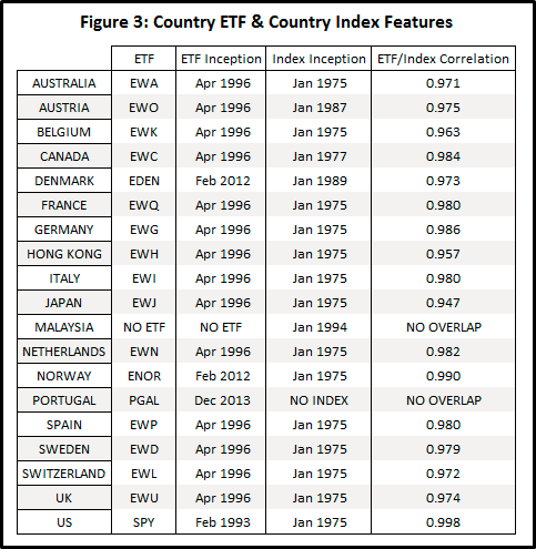
The correlations in Figure 3 are computed on monthly returns for all months where the ETF and index overlap. The smallest correlation among all 17 ETF index pairs is 0.947, so the index selections seem to be reasonable replacements; selecting matching indexes is part art: more analysis could be performed on comparing overlapping period risks and returns.
How do we weight each country within each long/short leg?
AQR indicates they use rank-weighting (more on that in Appendix D). Essay #2 uses equal weights, and so too will Essay #3. In Essay #2, the code here allowed the user to select “go long the top X and go short the bottom X of sectors” – I extend this for Essay #3 code to allow the user to “go long the top X percent and go short the bottom X percent of sectors” (rounded up to the nearest integer).
In 1975, there are only 14 countries with available returns, so going long/short the top 20% (rounded up) means there are 3 countries per long/short leg. From 1988 – 2021, there are always 4 countries per long/short leg (the number of countries with available data varies from 16 to 18, but 20% of {16, 17, or 18} always rounds up to 4).
Appendix C: Local Currency Returns
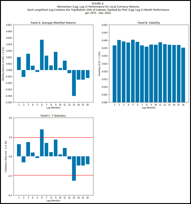
Figure 4 shows us that the main results from Figure 1 also hold true if instead we use local currency versions of each of the country equity indexes (instead of indexes for a USD investor). Figure 4, sourced from Fama/French DAT files here, and created from code here, demonstrates that the main results still held for local currency versions of country indexes for the 1975-2020 period:
The “fell off a cliff” point was still at lag month #13.
Volatility was flat across lags for countries.
Lagged month #1 contributed positively, though it was not statistically significant.
A quick note on robustness: in Figure 4, lag #6 shows statistical significance when we went long/short the top/bottom 20% of countries, and, unlike for USD returns, the t-stat stays above 1.96 when we use 33% instead of 20%.
Why does that robustness on lag #6 possibly matter?
The numeraire matters (reminder: everything in Figures 1-3 is denominated in USD) – that the numeraire matters is often overlooked in many academic and practitioner studies, especially those with a USA bias. Next time you read a USA-finance-porn headline of the variety “Gold is down 5%!” or “Bitcoin is up 8%!”, ask yourself if the primary contributor is movement in the USD.
Appendix D: Validation: Comparison to AQR Backtest
Figure 5 plots the country equity index momentum backtest returns provided by AQR versus a backtest14 (12,1) construction of the ETF15 data set described in Appendix B.
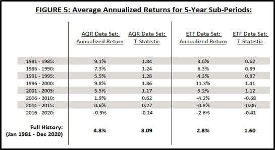
The t-statistics in Figure 5 are for a null hypothesis of a mean16 of zero.
The important features of Figure 5 are the following:
(A) Country momentum was superb from 1981 – 2005.
(B) Country momentum was less superb from 2006 – 2020.
(C) No 5-year sub-period produced returns statistically significantly different than zero.
(D) Momentum is not without risk.
(E) Both the AQR data set and the ETF data set validate (A), (B), (C) and (D).
For 2016-2020, the AQR data set and the ETF dataset contain the same 18 countries, so why doesn’t performance match? Two answers:
Different weights – AQR uses rank-weighting (see their disclosures that I pasted in Appendix B), and the ETF data set applies equal weighting.
Different data sets – AQR uses equity index futures, and the ETF data set consists of ETFs.
Do the differences presented in Figure 5 show evidence of a replication crisis?
Not necessarily! There are too many momentum studies, books, and, importantly, successful out-of-sample performances of real money funds to suggest that momentum doesn’t exist.
Well, are the AQR backtests for country equity indexes data-mined?
Probably a little! While rank-weighting isn’t unheard of, it’s less intuitive and less of a starting default than inverse-variance-weighting or equal-weighting.
I’m more inclined to cry wolf at data-mining when AQR also publishes language like this: “Momentum returns for these asset classes are in fact stronger when we don’t skip the most recent month, hence our results are conservative.” (see Appendix B).
If AQR’s stated goal was to avoid outlier influence (see Appendix B), rank-weighting doesn’t assuage that; rank-weighting is actually more likely to exacerbate an outlier’s influence. Not that avoiding outliers is necessarily bad – if you really think you can reliably detect outliers, then that’s great.
e.g. the S&P 500 for the USA, the Nikkei 225 for Japan. See Appendix B for a full list of countries considered & construction of this research data set.
Reminder: In many academic & practitioner finance papers you read, (12,1) means we include the previous 12 months, except for the most recent 1 month. Unfortunately this naming is not standardized across papers; e.g. in VME2012 the (12,1) construction in is called “MOM2-12” (i.e. constructed to include months 2 through 12). Sometimes you have to read the paper to decode what’s going on :) .
TC2017 note that (12,1) and (12,0) produce stronger in-sample results, except for country bonds and U.S. stocks.
Personal note: depending on the industry & other context, the term “data-mine” could be intended pejoratively, favorably, or neutrally. I hope it’s clear that the data-mining trap we’re trying to avoid is “p-hacking”: many research results, especially back-tests in the finance industry, are generally overstated. This bias is a byproduct of most research processes (not unique to finance); researchers try many different things and often don’t report failures, and unfortunately, strong incentives exist for reporting successes. When that’s the case, then traditional inference metrics are not valid (e.g. “The p-value is less than 0.01! The t-statistic is higher than 1.96!”)
The first month is nonetheless a positive signal, which is consistent with TC2017 who note that (12,0) produces stronger in-sample results than (12,2), and VME2012 who note that (12,0) produces stronger in-sample results than (12,1).
Same for the value factor.
e.g. stock momentum, sector momentum, country momentum, etc.
Personal note: Initially when I first starting reading academic finance papers I’d question “Really? All these guys did was run a regression, and that’s worthy of being published?” Now I’m sincerely more impressed with the deft language that some talented authors use in trying to have their cake (i.e. arguing that positive correlations suggest the factor is “everywhere”) and eat it too (i.e. arguing the correlation’s not THAT positive, you should combine sources to make a more robust factor, or pay us to do it for you).
Including correlations to your existing investments.
Look out for a future essay regarding the use of exponential weighting and other methods to assign more significance to more recent data.
The most recent ETF inception date is December 2013 for Portugal, which has no index available in the Fama/French public data library.
Technically not inception dates - Figure 3 indicates the first month for which a complete return observation exists.
The ETF backtest includes no transaction costs, which includes (but not limited to) – (1) a bid-ask spread, (2) borrowing costs for securities in the short leg of the factor, (3) a slippage model. As far as I can tell, this is also the case for the factors provided publically by AQR. For a thorough discussion of trading costs related to momentum, see Trading Costs of Asset Pricing Anomalies (2014).
The (12,1) choice is to match AQR’s (12,1) method – see Appendix B.
Arithmetic mean, not the CAGR (compound annual growth returns/rates) reported in Figure 5.